|
|
|
#1
 05-18-2007, 05:57 PM
|
||||
|
||||
|
Ok, I modified it a little to give a plank of wood look instead of the cloud of quilted maple thing in the previous.
PNG format 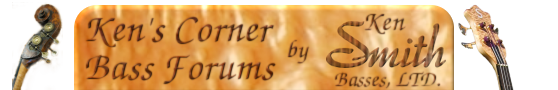 And since this version lends itself to GIF a little better here it is in that format, though the jagged edges turn me off in the GIF version: 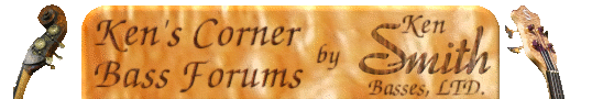 I got 10 minutes of free time at work today so this is what I did.. Let me know if there are more suggestions.
__________________
Proud original owner of a 2001 Ken Smith BSR4EG lined fretless. My band's site: Delusional Mind 
|
|
#2
05-19-2007, 12:31 AM
|
||||
|
||||
|
Looking good. I personally would prefer the Basses on the wood and not on the sides. Other than that, I think it's a good entry for the contest.
 What Contest?  Who said anything about a contest? ") What's the prize for the winner?  Winner of what? 
__________________
Ken Smith ~ http://www.kensmithbasses.com http://www.kensmithbasses.com/doublebasses/ http://www.facebook.com/KenSmithBasses https://www.instagram.com/kensmithbasses/ https://www.facebook.com/ken.smith.904750 
|
|
#4
05-19-2007, 10:12 PM
|
||||
|
||||
|
Are you talking about the texture on the word Smith? I used flamed maple to bump map some cocobolo thereby making a flamed cocobolo texture. The rest of the text is technically cocobolo as well but the lines are thin enough you really can't see the grain. I was going for multiple textures so the image wouldn't be too drab looking. I wanted to stick with wood textures due to the topic at hand, and it seems Mike is planning a wood theme for the forums.
Ken, I left the basses standing to the sides so they would stand against whatever background Mike uses for the forum. If he uses a wood texture for the background image, then the basses will stand against it instead of my quilt. It helps to make them more itegrated with the rest of the forum's look and not necessarily a part of the forum header.
__________________
Proud original owner of a 2001 Ken Smith BSR4EG lined fretless. My band's site: Delusional Mind
|
|
#5
05-20-2007, 05:39 AM
|
|||
|
|||
|
Thats cool, but I just felt that you can still make it look wood themed without having wood used in every element. The textures can make it look a little cluttered visually. As with the gallery photos, sometimes if you have two elements that are contrasting in visual qualities, it can make either much more distinct.
The use of 'positive contrast' is used frequently by modernist architects such as Mies Van Der Rohe in furniture or built forms. Have a look at this piece of furniture as an example:  Can you see how the leather is soft, dark, textured, matt, yielding whereas the chrome tubes are hard, reflective, glossy, smooth and structural? When you put them next to one another either element becomes that much more distinctive because of its contrasting relationship with the other element. Visually it also looks very clear about what the function of each element is, because of the way in which the finishes have been chosen - that is to say its easy to tell instinctively which bit was made for touching without necessarily knowing what the purpose of the object is. The use of positive contrast was the kind of idea I was using as the basis for my suggestion  Last edited by Steve_M; 05-20-2007 at 06:00 AM. Reason: didn't spell Rohe right!
|
|
#6
05-20-2007, 12:30 PM
|
||||
|
||||
|
What do you think of a dark wood with brass lettering?
__________________
Proud original owner of a 2001 Ken Smith BSR4EG lined fretless. My band's site: Delusional Mind
|
 |
| Currently Active Users Viewing This Thread: 2 (0 members and 2 guests) | |
|
|


 Hybrid Mode
